Responsive (and Responsable) Per-page Background Images with WordPress
Full-page Background Images can do a lot to spice up the design of a somewhat minimalist site without detracting from the content being displayed. The problem is that in order for them to look reasonably crisp and professional they are often quite large. There are and should be several precautions when adding any large image to a site. Images should be compressed and in the appropriate format and if necessary stored on a CDN. But it is also important to display the correct image size for the correct screen size.
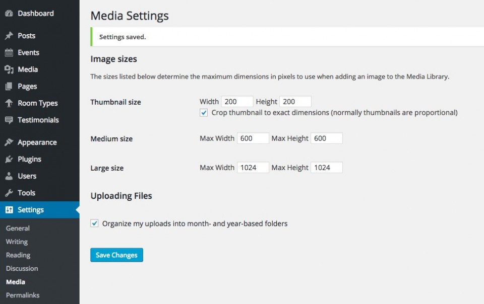
One of the nice things about WordPress is that for every image added to the media library there are several images generated. This does depend on the size of the original image. When adding a full-screen background image we would need to start with a decent-sized image at least 1200px wide. WordPress then would generate additional image sizes determined by the values in Settings > Media.
WordPress also allows for a custom background in the Customizer and allows you to specify how it is presented as well as some defaults. To make use of this functionality, you can add the following to your theme or child theme’s functions.php:
  function mytheme_custom_background(){
    add_theme_support( 'custom-background', apply_filters( 'mytheme_custom_background_args', array(
    'default-color'          => '#ffffff',
    'default-image'          => '',
    'default-repeat'         => '',
    'default-position-x'     => '',
    'default-attachment'     => '',
    'wp-head-callback'       => '_mytheme_custom_background_cb',
    'admin-head-callback'    => '',
    'admin-preview-callback' => ''
    ) ) );
  }

  add_action( 'after_setup_theme', 'mytheme_custom_background');
You’ll notice I’ve added a callback function to to 'wp-head-callback' This is where we are going to enable out per-page background.
We’ll start by creating the function and determining if the page concerned does indeed have a featured image. If the featured image isn’t large enough we’re not going to bother displaying it. In this case, we will use the background image or the background colour from the Customizer. If none of these conditions are true, i.e. no featured image or background image or colour has been set, then we abandon ship with return.
  function _mytheme_custom_background_cb() {

  $is_big = (wp_get_attachment_image_src( get_post_thumbnail_id(), 'large' )[0]) ? true : false;

  if ( has_post_thumbnail() && $is_big ){
      $background= wp_get_attachment_image_src( get_post_thumbnail_id(), 'full' )[0];
      $background_lg = wp_get_attachment_image_src( get_post_thumbnail_id(), 'large' )[0];
      $background_med = wp_get_attachment_image_src( get_post_thumbnail_id(), 'medium' )[0];
      $color = 'dddddd';
  } else {
      $background= get_background_image();
      $color = get_background_color();
  }
  if ( ! $background && ! $color )
  return;
Otherwise, we proceed to define the appropriate image sizes. We begin by setting the background colour in case it is specified and then if $background is defined we match the image size with the matching variable. These sizes can vary and will have to be determined on a per-project basis. We, once again, determine if we are dealing with a large featured image or a background image by using our $is_big condition. We also define values for background-repeat, background-position, and background-attachment in case they are not defined in the Customizer settings. Finally we concatenate the string of styles that will be displayed in our document head taking care to add a fallback in case we don’t have all the image sizes at our disposal.
  $style_lg = $color ? "background-color: #$color;" : '';
  $style_med = $color ? "background-color: #$color;" : '';
  $style_sm = $color ? "background-color: #$color;" : '';

    if ( $background ) {
      $image= " background-image: url('$background');";

      if ($is_big){
          $image_lg = " background-image: url('$background_lg');";
          $image_med = " background-image: url('$background_med');";
      }

      $repeat = get_theme_mod( 'background_repeat', 'repeat' );

      if ( ! in_array( $repeat, array( 'no-repeat', 'repeat-x', 'repeat-y', 'repeat' ) ) ){
          $repeat = 'repeat';
      }

      $repeat = " background-repeat: $repeat;";

      $position = get_theme_mod( 'background_position_x', 'left' );
      if ( ! in_array( $position, array( 'center', 'right', 'left' ) ) ){
          $position = 'left';
      }

      $position = " background-position: center $position;";

      $size= " background-size: cover;";

      $attachment = get_theme_mod( 'background_attachment', 'scroll' );
      if ( ! in_array( $attachment, array( 'fixed', 'scroll' ) ) ){
          $attachment = 'scroll';
      }

      $attachment = " background-attachment: $attachment;";

      $style_lg .= $image . $repeat . $position . $attachment . $size;

      if ($is_big) {
          $style_med .= $image_lg . $repeat . $position . $attachment . $size;
          $style_sm .= $image_med . $repeat . $position . $attachment . $size;
      } else {
          $style_med .= $image . $repeat . $position . $attachment . $size;
          $style_sm .= $image . $repeat . $position . $attachment . $size;
      }
    }
  ?>
The last thing we need to do is to add our Media Queries within the style brackets. Again, this will vary depending on your image sizes.
<style type="text/css">
    body.custom-background { <?php echo trim( $style_sm ); ?> }

    @media (min-width: 500px) {
        body.custom-background { <?php echo trim( $style_med ); ?> }
    }
    @media (min-width: 800px) {
        body.custom-background { <?php echo trim( $style_lg ); ?> }
    }
</style>
All together now:
To see this in its entirety https://gist.github.com/23e47b5b317d9d761aa0
*[CDN]: Content Delivery Network