CSS Properties: object-fit and object-position
CSS has many obscure properties that can can really make a difference with browsers that support them. Two of these are object-fit and object-position.
The benefits of these two properties is that the allow us to determine the portion of an image that will be seen at various widths, so that by using media-queries different portions of the image can be included or priority can be given to which portions are cropped.
Here are some examples of how using these properties can give some control over the image output:
See the Pen Untitled by Kirsten Cassidy (@mantismamita) on CodePen.
In the last example Lisa’s face remains in the centre of the image area. By tweaking the image in media queries a single image can be adapted to any allocated space. By using the <picture> element and srcset attribute a great degree of control over the presented image on any given device can be achieved.
Although they are still unsupported in IE, their advantages are best noticed on mobile devices which are largely supported. 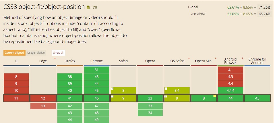
The good news is there is a javascript polyfill for those browsers who are not yet there.