Creating a full-width Responsive Google Map
I think anyone who has created a website using a Google-map can agree that one of the easiest ways to display a Google Map is to embed it in an <iframe>. But what if you want to use it as a header image, or any width that is not pixel based? The trick is to adjust the aspect ratio and apply it to the bottom padding.
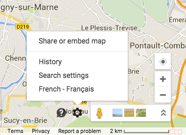
We’ll start with a Google Map. The Google Map interface is prone to change but as of today you can go to the little settings cog and choose to share or embed a map.
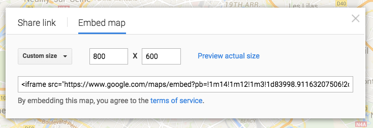
You can even create a custom size for your embedded map.
But that’s the easy part. What about making it full-width?
Simply copy the iframe into your page and add the following CSS styles:
For example: https://gist.github.com/9aa735f89f04690a56ef
Will give us:
Feel free to adjust your browser width to test it. This technique can be used with most iframe embedded content as well as images and videos and is described in the articles below.